Museum Island
1
2
3
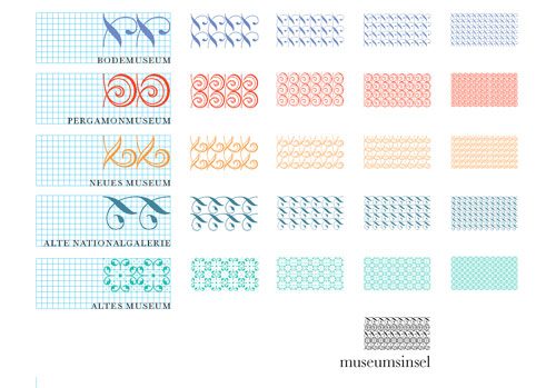
Proposal for identity and orientation system for Berlin's central cluster of major museums, 3rd prize in international 2-stage design competition, 2002
Design: Oliver Klimpel, Alexander M?ller, Svend Wennick
Research and Editing: Vladimir Balzer?
The concept proposed a flexible multiple identity, reflecting the complexity of site and collections. The different museums and buildings would be made identifiable by a logo matrix of ornaments. Each building complex would communicate in a specific synchronized colour spectrum of key and supporting colours. The logo of the Museum Island as a whole: the equation of all buildings and ornaments. In the orientation system various distances are indicated by four different logo versions with different numbers of ornaments used in each of them.
Rules for information access and the visual components are established in a visual hierarchy scheme. From the umbrella identity of Museum Island to sub-brands as caf?, shop and media centre: the same visual language is used.