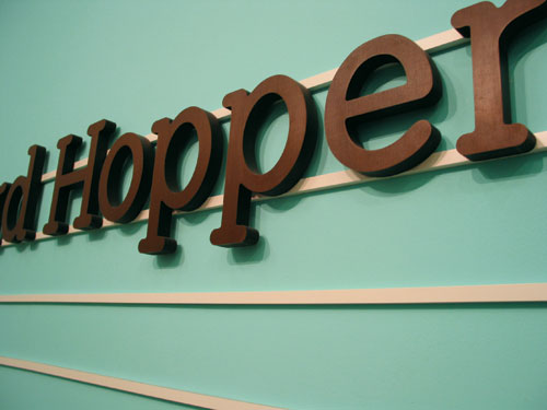
A bespoke slab serif typeface was designed, based on the TATE font, which was used as a key element in this exhibition design, beside the colours scheme and detailed typography for the space, including an additional interpretations area, and the printed exhibition guide. For the entrance a 3-dimensional typographic display in Wenge verneer was created.